

Here is a link to the original stock image used for this tutorial. A PSD is also available for this icon to help you follow the tutorial and for learning purposes.
Resize the stock image within a 100 x 100 pixel canvas size
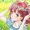
icon-dandelion-step1 Add a Curves adjustment layer by going to "Layer" in Menu, under "New Adjustment Layer" there is the option "Curves..." and the settings can be seen in the image below. Don't worry too much about getting this identical, there is a PSD download available. Reduce the opacity of this Curves layer to 75%
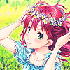
icon-dandelion-step2 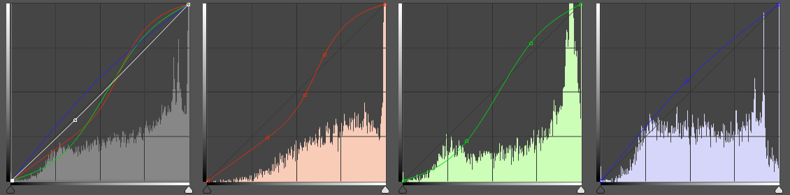
icon-dandelion-step1-curves Add a Color Fill adjustment layer of a dark purple (#360953) with a Linear Burn blend mode at 20% opacity.
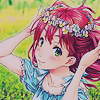
icon-dandelion-step3 Add another Curves adjustment layer with 85% opacity.
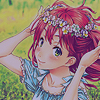
icon-dandelion-step4 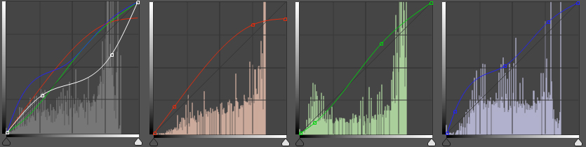
icon-dandelion-step4-curves Add a Photo Filter adjustment layer with orange (#f38417) with Screen blend mode at 64% opacity.
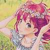
icon-dandelion-step5 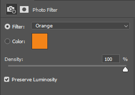
icon-dandelion-step5-photofilter Now for textures! My first texture was from narcoticplease at DeviantArt, I didn't resize the texture and used a segment. This texture has a Soft Light blend mode at 30% opacity. The second texture is from inconditionally at DeviantArt with a Saturation blend mode at 100% opacity. I really liked that it changed the colour of her hair, eyes and add a slight tan to her skin so I kept this.
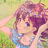
icon-dandelion-step6 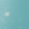
icon-dandelion-step6-texture1 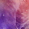
icon-dandelion-step6-texture2 Next I wanted to work on the reducing the saturation from the last texture I used. In this step, I create two Gradient Map adjustment layers. The first gradient map is the standard black (#000000) to white (#FFFFFF) with a Vivid Light blend mode and 15% opacity. The second gradient map is a grey (#4D4648) to a light tuquoise colour (#D7FFF3) with a Lighten blend mode at 20% opacity.
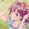
icon-dandelion-step7 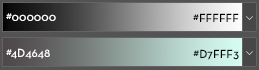
icon-dandelion-step7-gradient Now my last step washed out the colour a bit too much... so this step was adding more "warmth". I create a Photo Filter adjustment layer with a dark red colour (#981a1a) and reduced the density to 75%. This layer had a Multiply blend mode and 20% opacity. Then I create a Color Fill adjustment layer of a light pink (#de8a8a) with a Soft Light blend mode and 50% opacity.
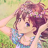
icon-dandelion-step8 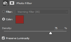
icon-dandelion-step8-photo-filter I use another texture from dastardly-icons at DeviantArt. I usually use the Smudge Tool to remove/clean any specks from a texture off the character's face and other areas to ensure it's not overwhelming the design (see texture below). I place the wisps in various places around the character and cut away the rest of the layer using the Polygonal Lasso Tool (see screenshot below).
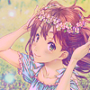
icon-dandelion-step9 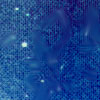
icon-dandelion-step9-texture 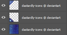
icon-dandelion-step9-layers
And that's when I stopped, finally satisfied with my icon and this is where the tutorial ends. Hope you liked this tutorial and found it helpful :)